Most reports get read once. These were designed to be kept.
Founded in 2019, Stride is a leading credit fund investing in sponsor backed ventures across the Globe. Each year, they publish a report on the state of the market they operate in. We were brought in to design the Stride Ventures Global Private Debt Report 2026, their annual report on venture debt and growth credit across India, the GCC, the UK, and Europe.
The brief, on paper, was straightforward: design the annual report. The brief, in practice, was something more interesting. Annual reports are usually treated as documents that record activity. Stride wanted theirs to do more than that. They wanted it to organise how the market thinks of itself, and to stay in the rooms where decisions get made.
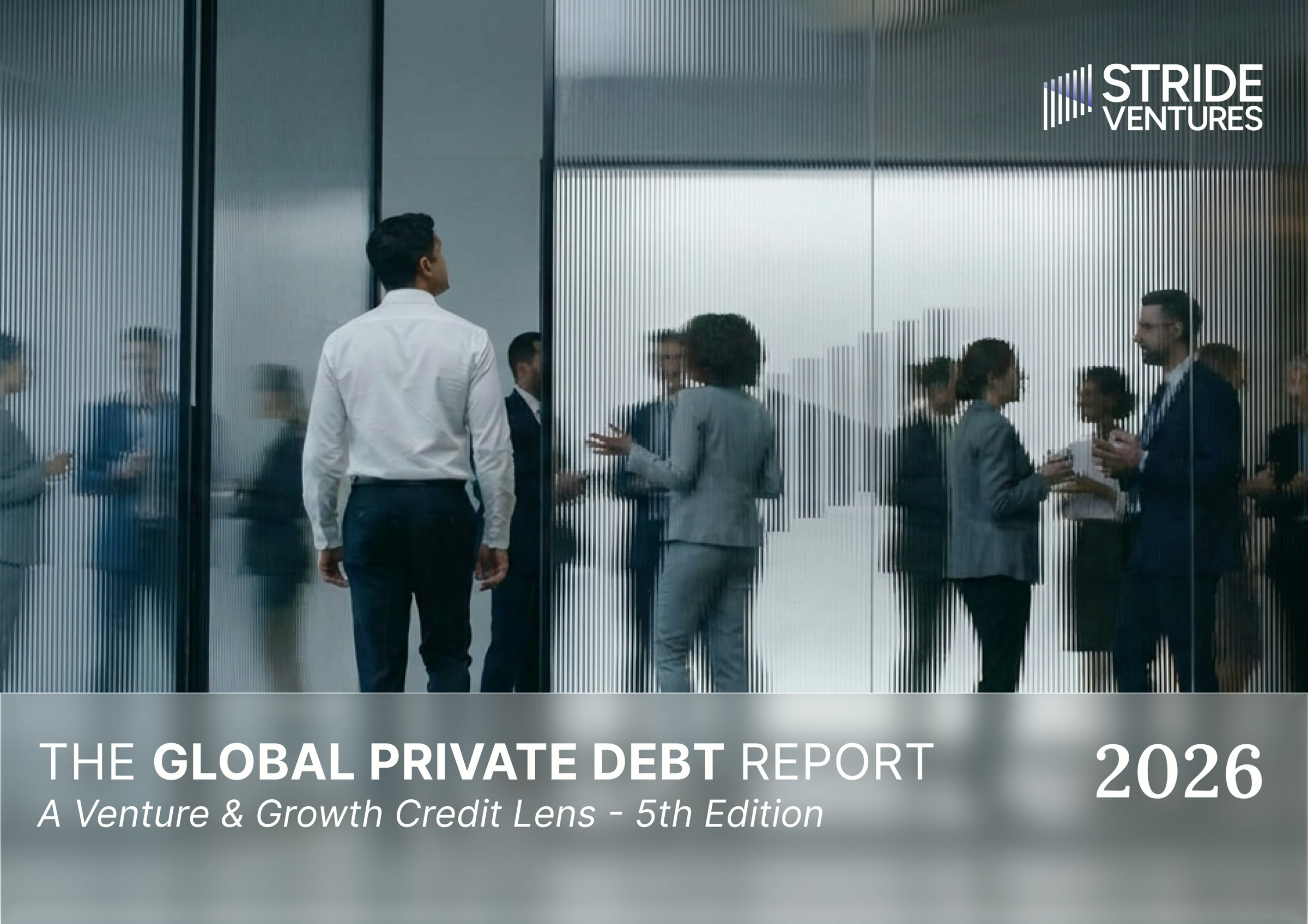
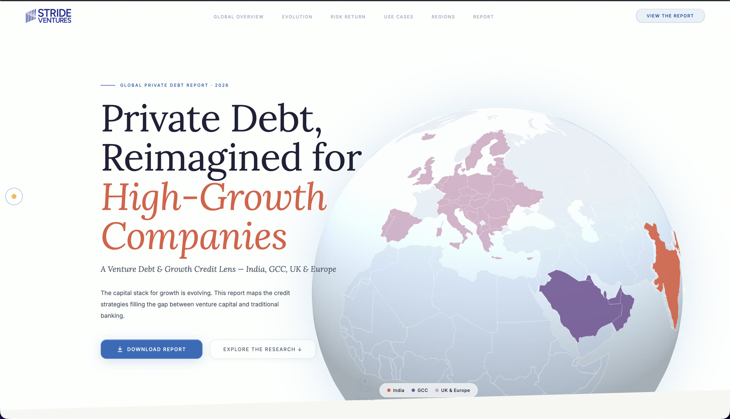
The Stride Ventures Global Private Debt Report 2026.
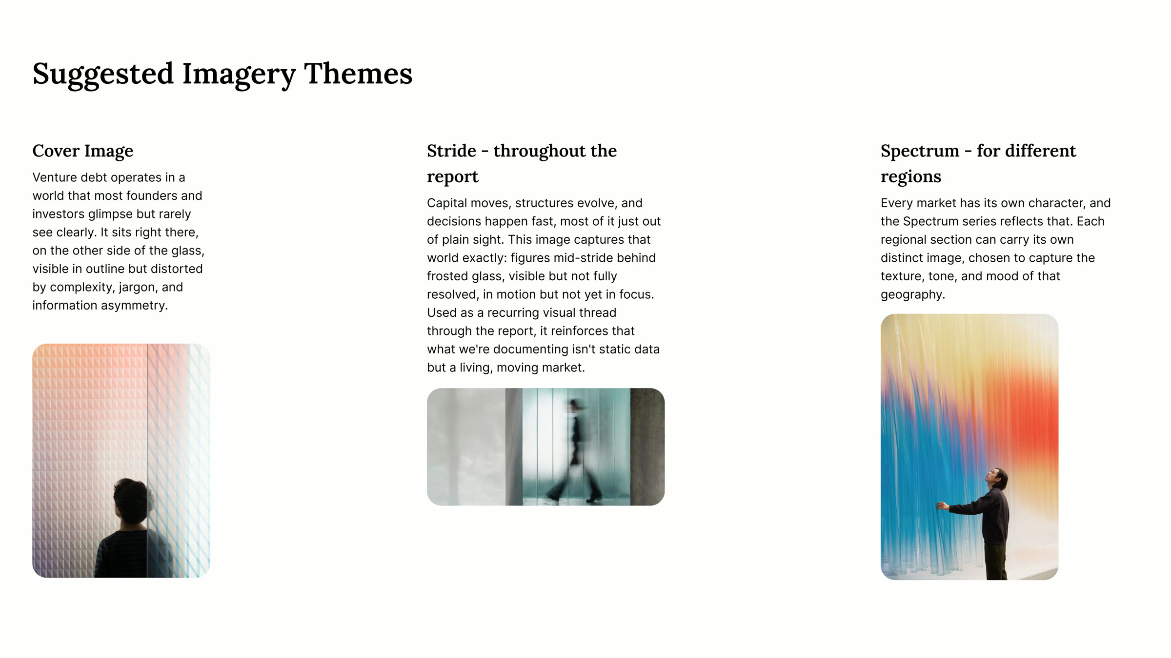
Venture debt is an opaque market by default. The structures are technical. The vocabulary is specialist. The deals happen in private rooms and resurface as numbers in spreadsheets. The audience for a venture debt report is sophisticated, but the market itself is still mostly unread, even by people inside it.
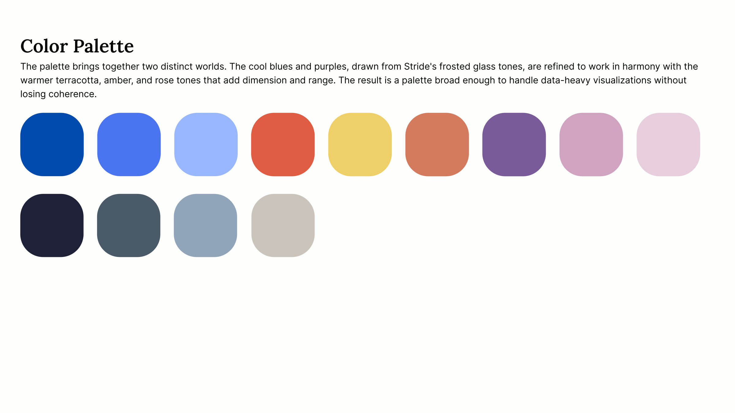
The design challenge wasn't to simplify. Simplification would have insulted the audience and stripped the report of the precision it needed. The challenge was to make the market legible to itself without dumbing it down, and to make the report something that would survive beyond the week it landed.
The question we kept coming back to: how do you make a report stay?
Creative direction: the visual language before it became the box.
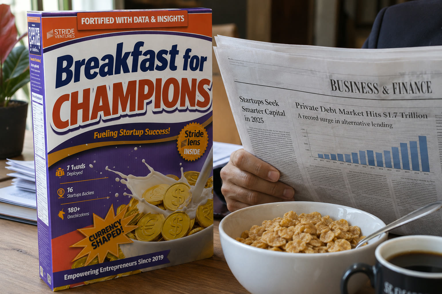
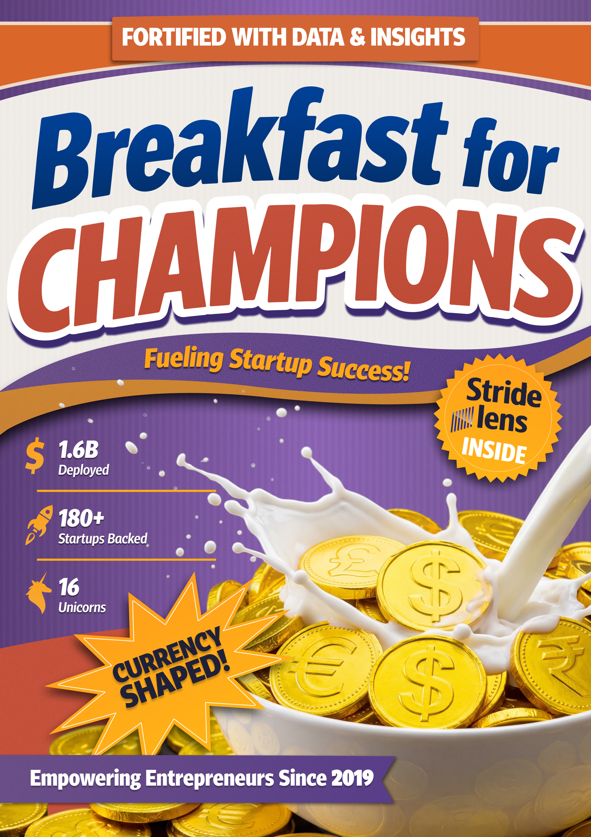
Our answer was a cereal box.
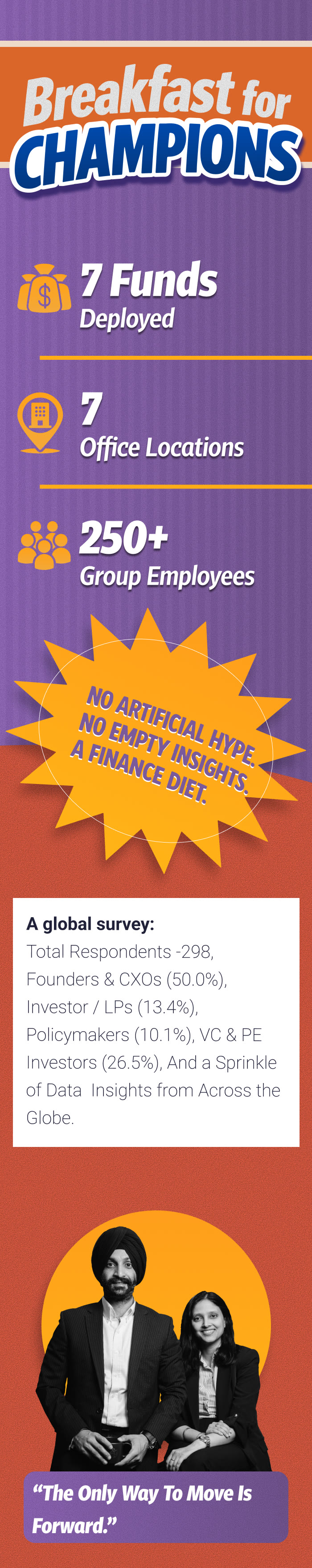
The Stride Ventures Global Private Debt Report 2026 was packaged inside a fully designed cereal box, in the lineage of Wheaties' Breakfast of Champions. The cereal was Stride Bites. The tagline read The Breakfast of Champions. The front panel carried Stride's headline metrics: ₹1.6B deployed, 180+ startups backed, 16 unicorns, in the format of cereal box boasts. One side carried the report's data as a nutrition label. The opposite borrowed the athlete-spotlight tradition for portfolio companies.
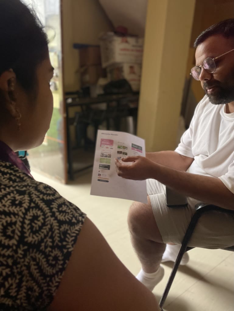
The cereal box was produced in a small run and hand-delivered to a few people inside the firm. That was the point. It was never going to compete with mass distribution. It was going to sit on desks, get photographed, and become an object the firm's closest readers remembered.


Front, spines, back: every face of the box resolved.
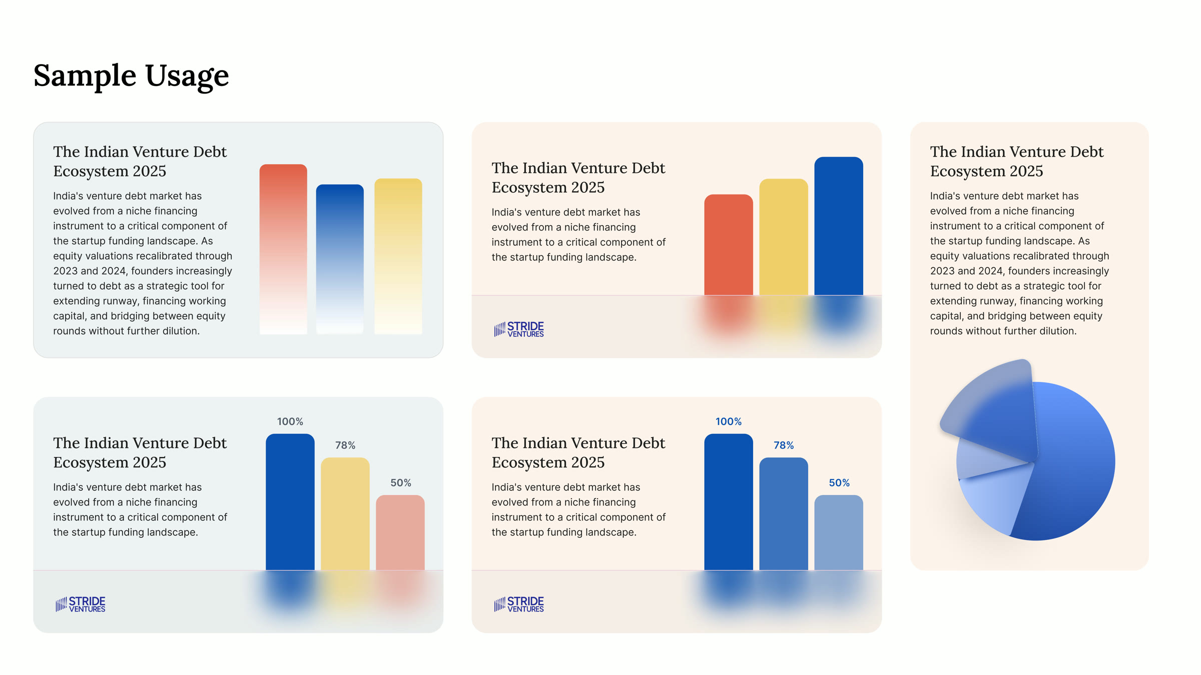
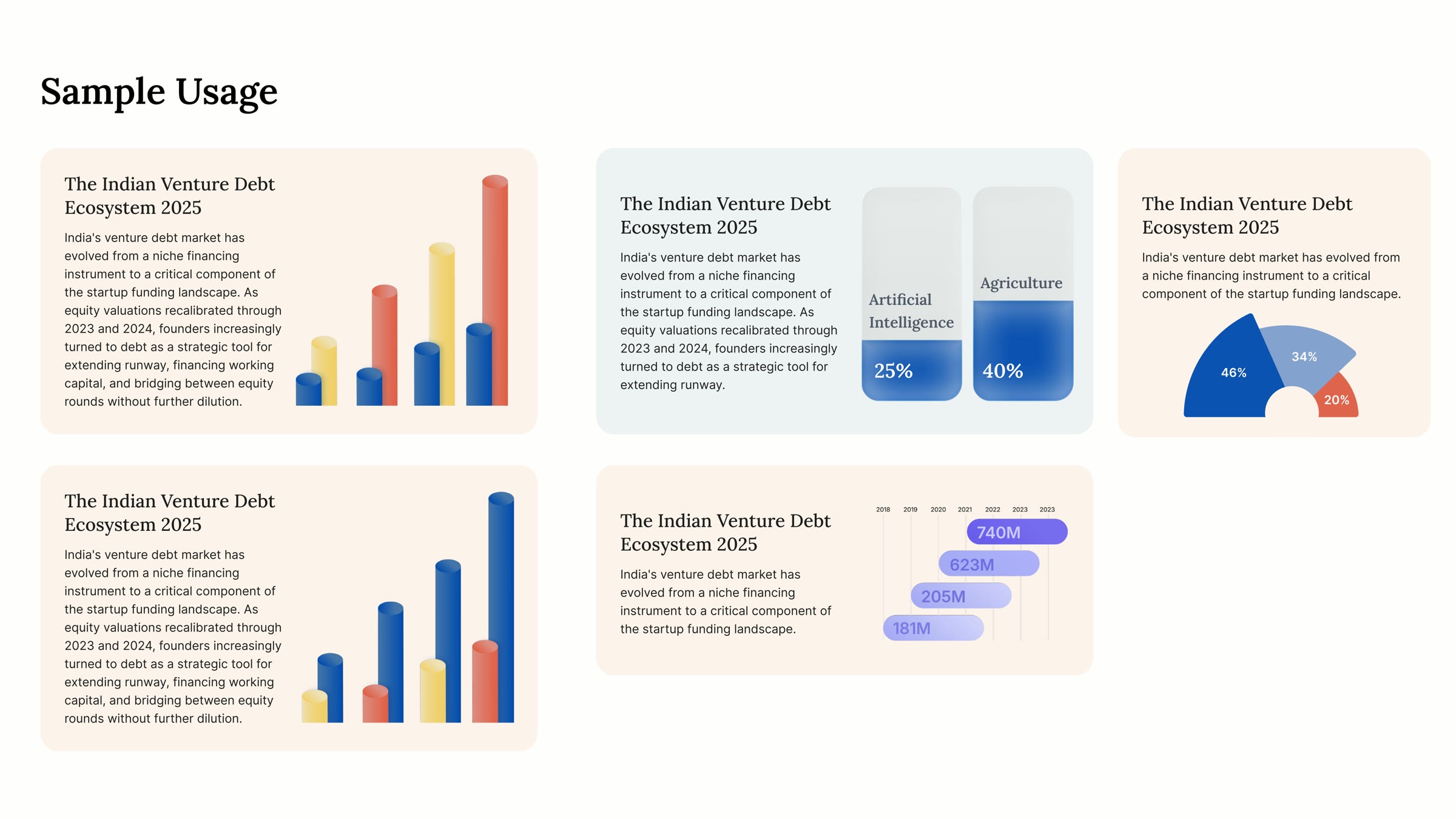
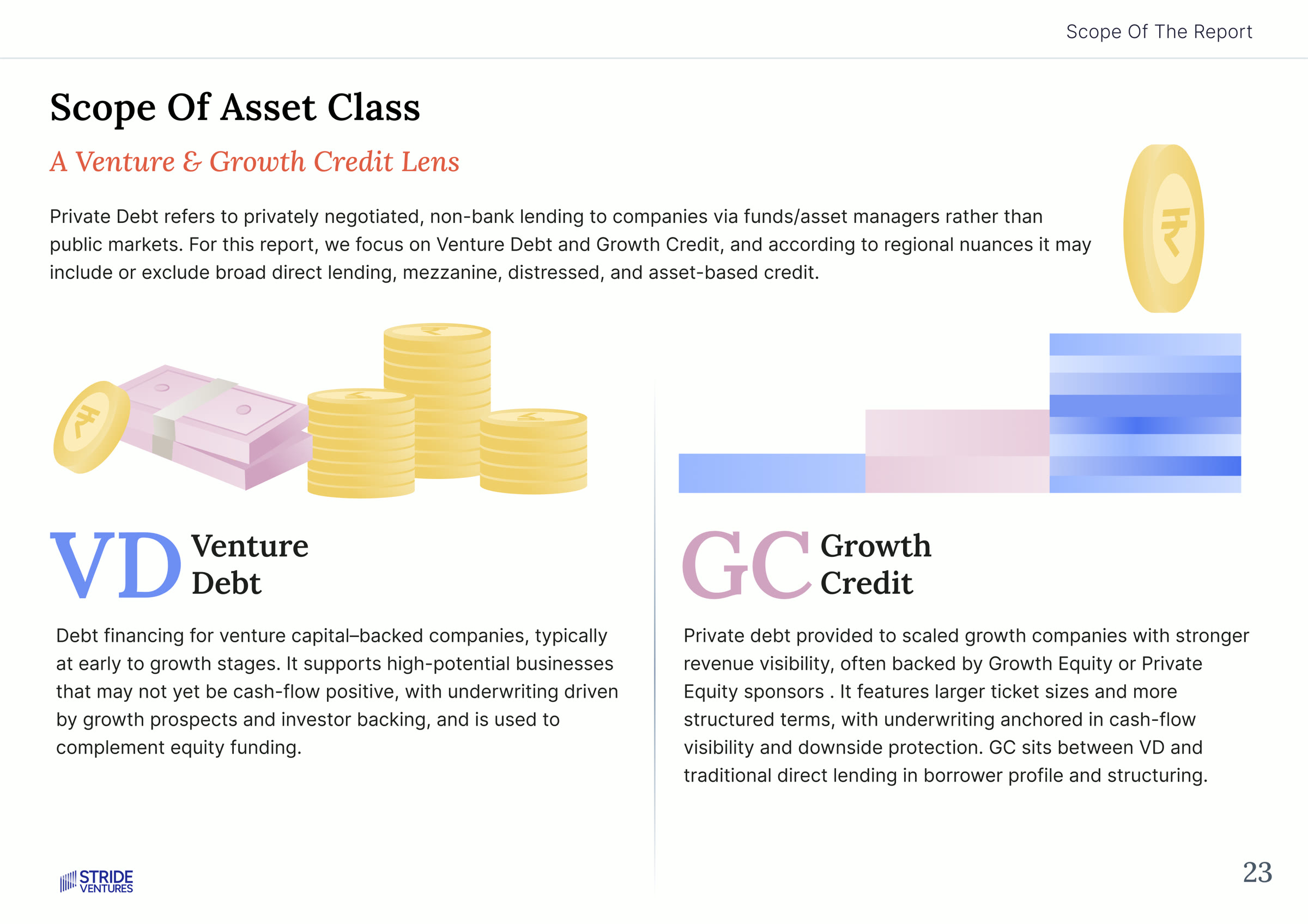
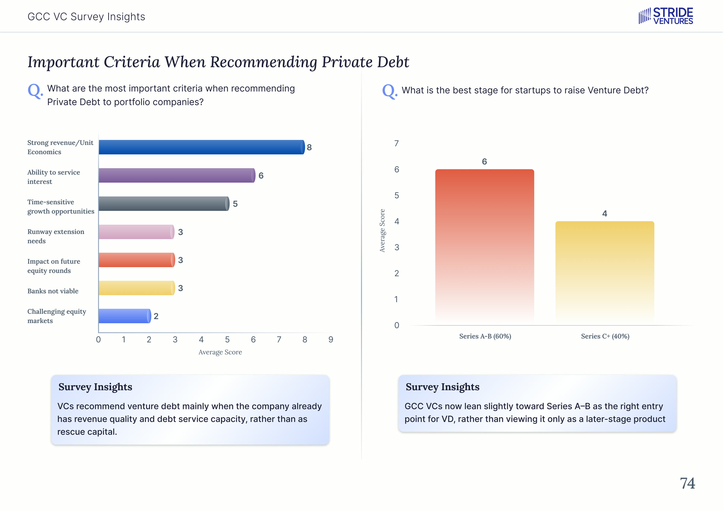
Inside the box sat the report itself: 74 pages covering venture debt and growth credit across four markets. The design work was to give dense, technical research a visual grammar precise enough to hold up under scrutiny without hiding what it was saying. Each market had its own data story; the spreads gave every argument room to land.
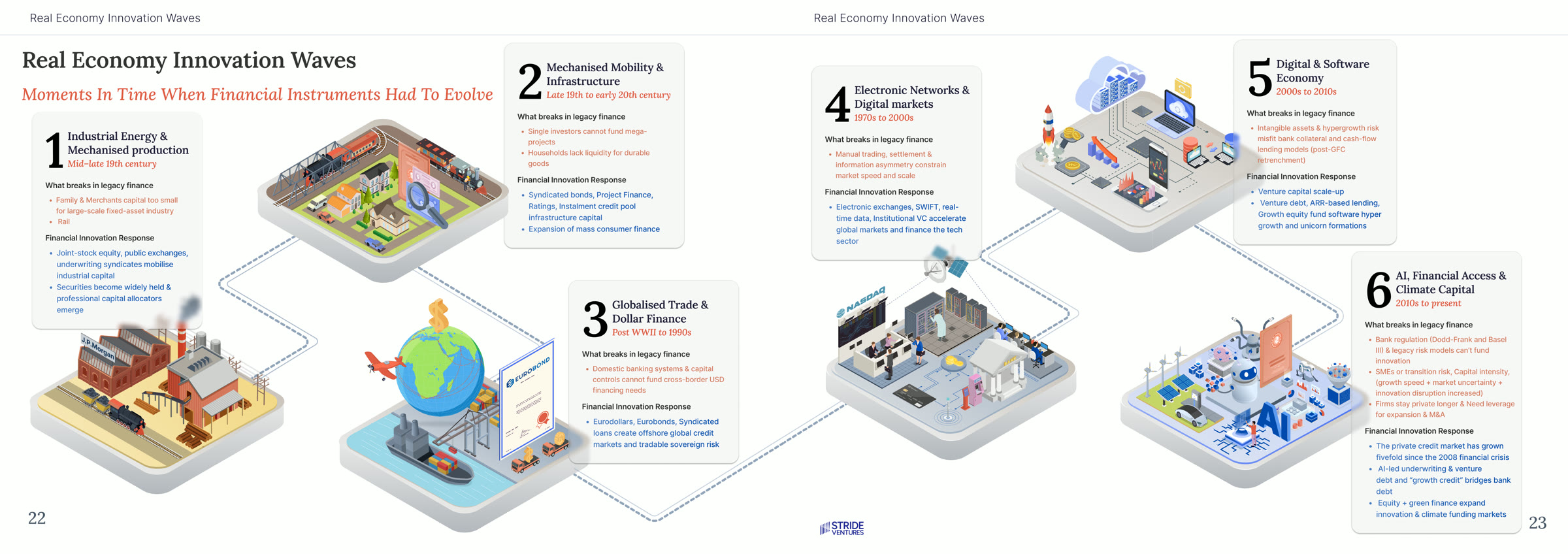
The conceptual centrepiece was a double-page spread charting six waves of real-economy innovation, from industrial capital to AI and climate finance, and the private debt instruments that had to evolve at each transition. It gave the market a picture of itself it hadn't quite seen before.
Alongside the box, we designed a microsite as the report's digital home. Its top layer was a quick view: the headline data and key charts, formatted to be scanned in a couple of minutes. Below that sat the full report, available to anyone who wanted to read further. The box went to a small list inside the firm. The microsite let the work reach everyone else.
The packaging wasn't a marketing gimmick layered on top of a report. Neither was the site. They were part of the design problem from the start. The form a report takes is part of what the report says.
The microsite is live and open to anyone.
Explore the microsite →Annual reports get treated as deliverables. The thinking goes: someone needs a record of the year, design makes it look professional, the report is the output.
This work taught us to treat annual reports as market infrastructure instead. A report that gets kept on desks does ongoing work for the firm that published it. A report that gets read once does almost no work at all. The difference between those two outcomes isn't in the data inside. It's in how seriously the form is taken.
For markets that hide in plain sight, the report can be the thing that brings them into focus. For firms that want to be remembered, the report can be the artefact that earns the remembering. We approach this kind of work with both ambitions held at once.